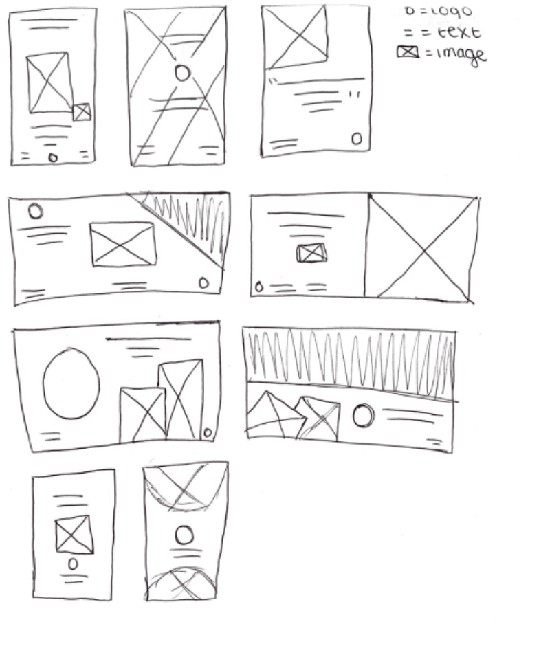

Every parent wants their child to eat healthy, maybe a little less of the potato chips and more of a fruit, Well why not have both? No-Tato is an all organic company that helps children engage more with healthy snacks making air dried fruits into your average chip to savor. No-Tato was inspired to say “there is no fat, there is no nasty preservatives, we are all healthy!” What better way to explore your child’s taste buds with a great fruit-filled snack. As a designer I wanted to gather more amazing ways to produce and solve a great product parents and kids can enjoy.
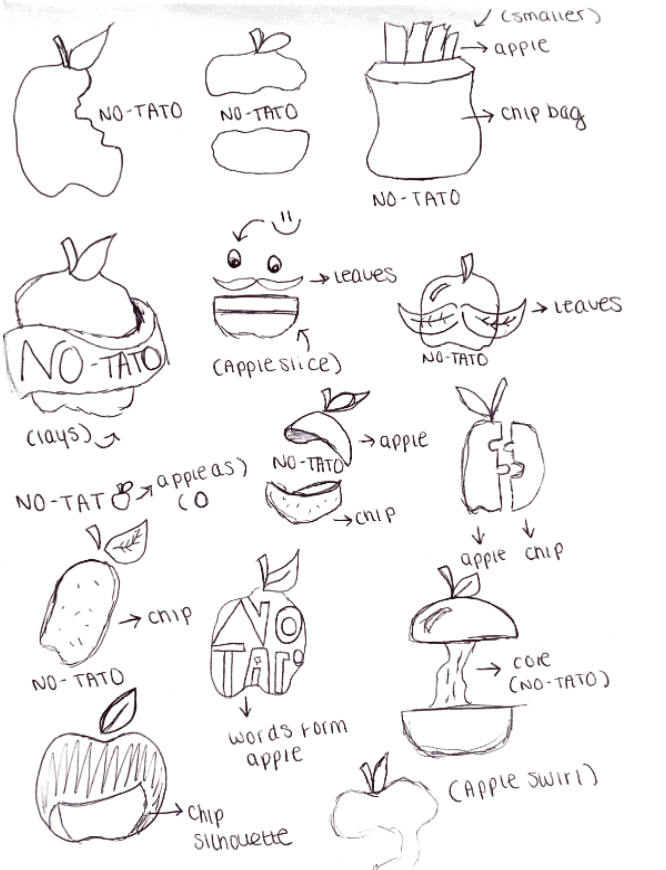
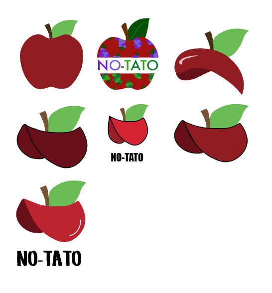
The idea behind the logo was to morph both a chip and apple together. The best way to really bring forth that fun yet healthy style was to make the entire “chip” the apple in representing “No-Tato.” It really tricks the brain to think that you’re looking maybe eating a junk food snack but it is not. I really wanted to play around with the morphing execution of this logo and still give it that bright red, green and brown appeal. The font was to represent a child’s hand-writing as if they drew it with marker and involve settle hints of “chips” through the use of yellow within “tato.”
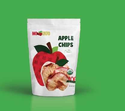
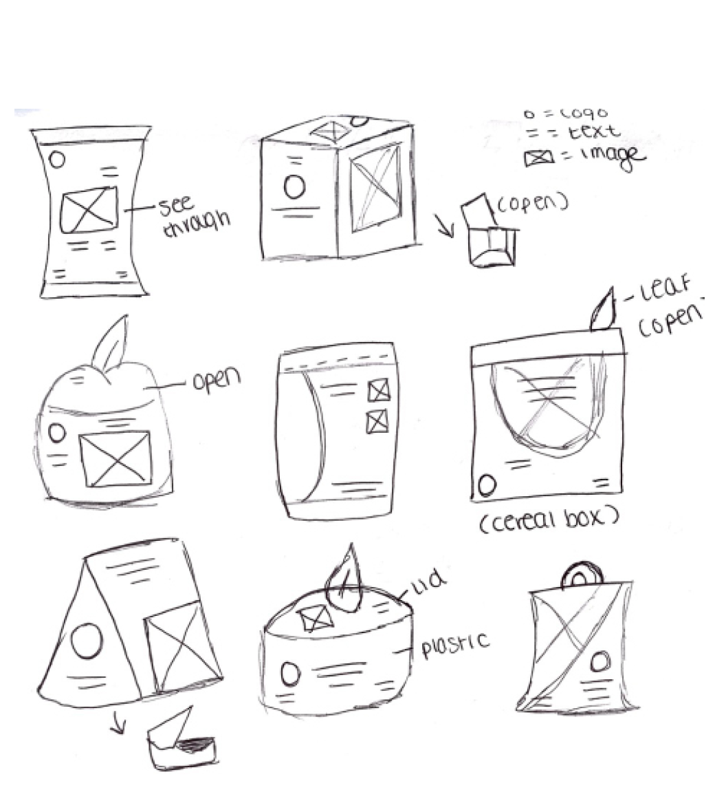
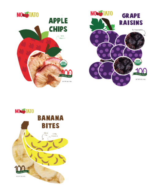
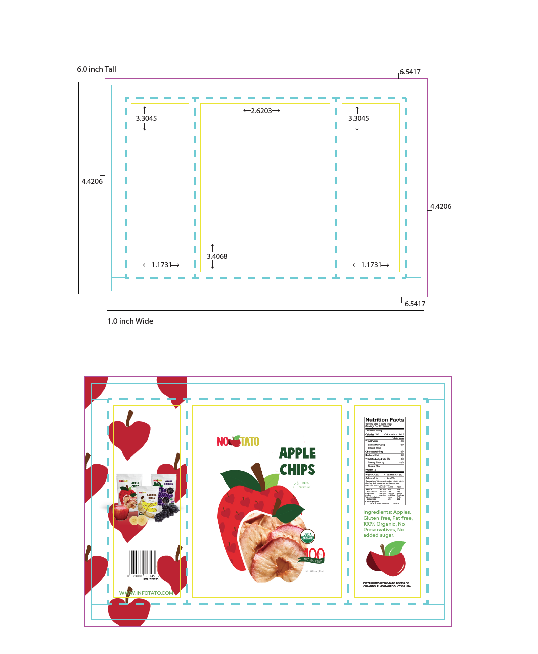
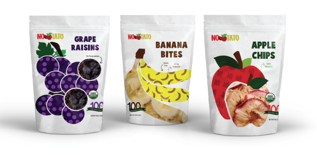
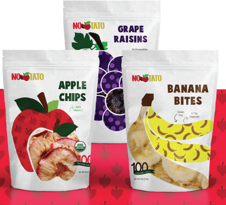
When thinking upon inspiration of something that could be inspiring for both children and adults, I wanted to create something fun, something still tasteful that didn’t scream “no sugar!” The idea was to have an overall open window to the child, crayon like type & design to allow the child to visually see the food item. Keeping the actual package a clean white, I focused more of color scheme on the actual logo and brand. In the end, I wanted this is to be simple but screamed cutsey and as if a child had drawn on the package.
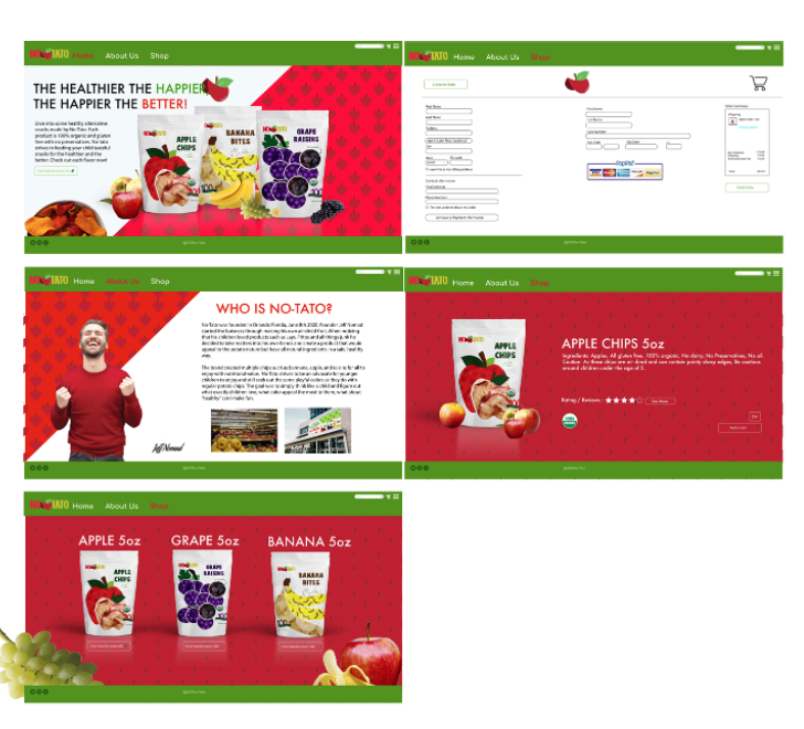
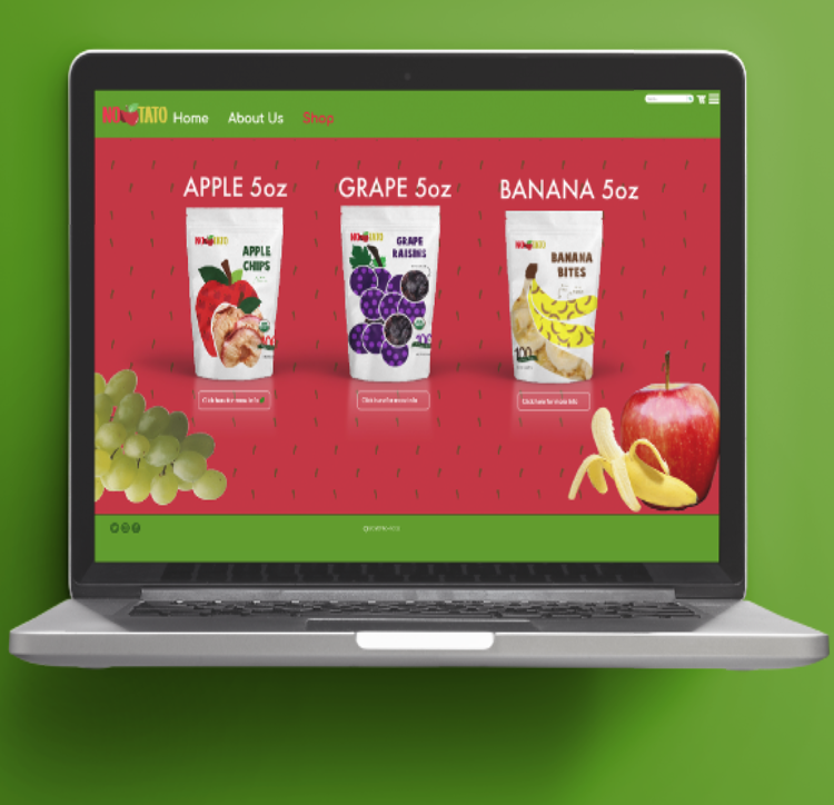
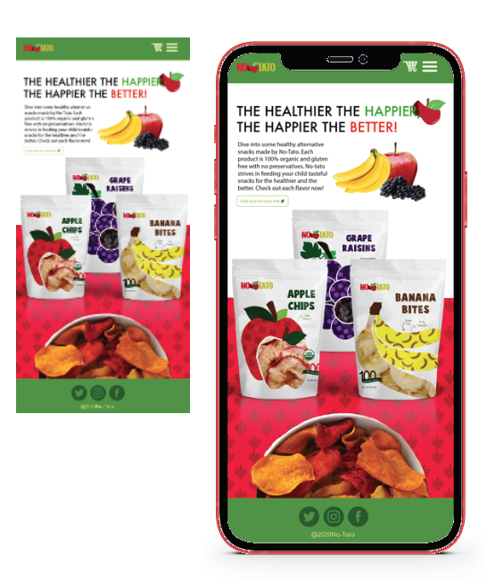
The website was equally as important to make it appear just as fun as the packaging, just as bright, and just as kid-friendly while maintaining an adult appeal. Using bright red and greens to emphasize the apple was a must in making this site come to life and feel delicious. I made sure to make the site just for No-Tato and the 3 chip brands best known with reviews. The overall site was to express the same amount of joy as someone trying the snack for the very first time
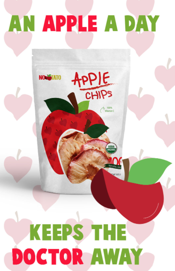
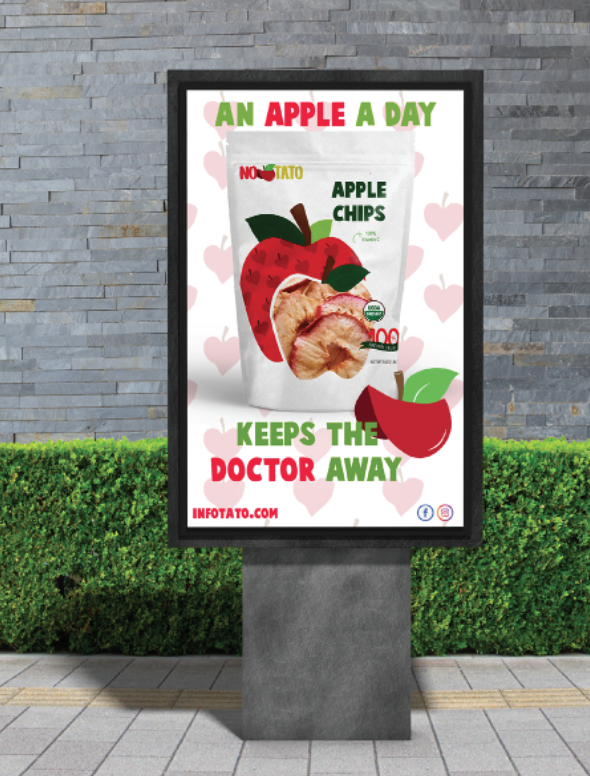
Making both a gigantic store front, and lightup board for local areas, I wanted to keep the same approach in color, style, and cohesiveness so that people would recognize No-Tato's ad's from anywhere through shape and emotion.
