
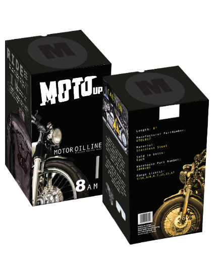
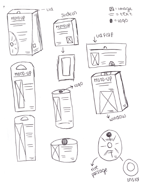
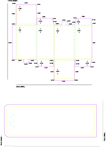
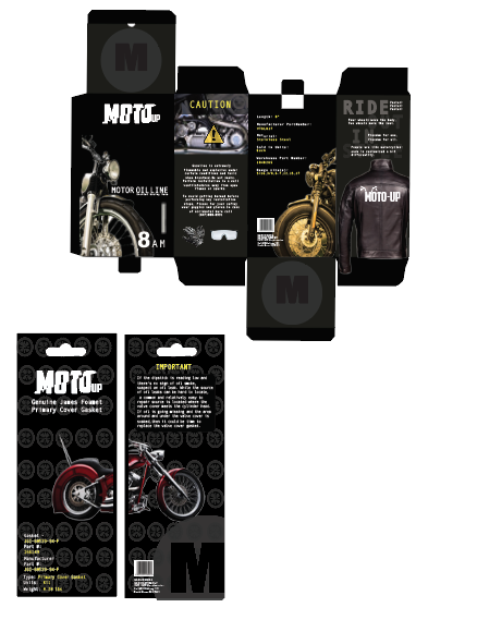
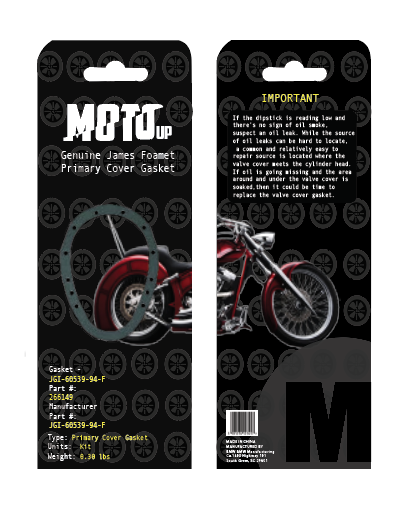
Motorcycles are a hot product between both men and women, however most packaging and sometimes adverstisement doesn’t attract the way we want them to. The idea behind Moto-UP was to use a complete sleek, professional package that was both in-expensive but attractive to both women & men. The ideas were to make a competitive package that could go hand in hand with top brands such as Harley Davidson, & BMW Motorcycles yet appease for long rides and fun adventures.
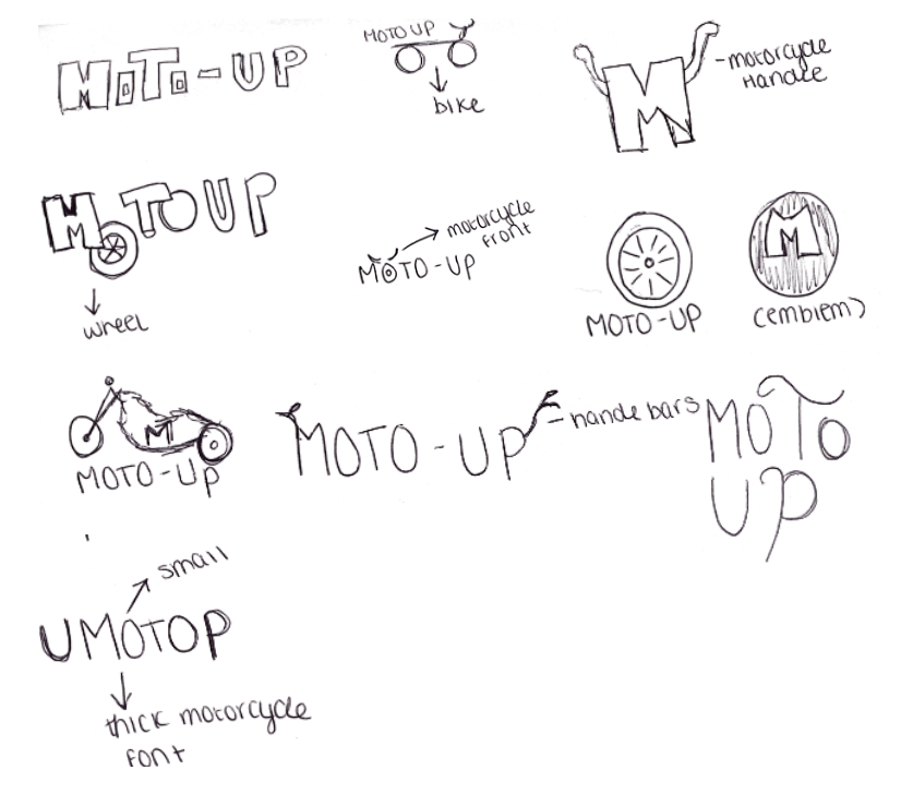
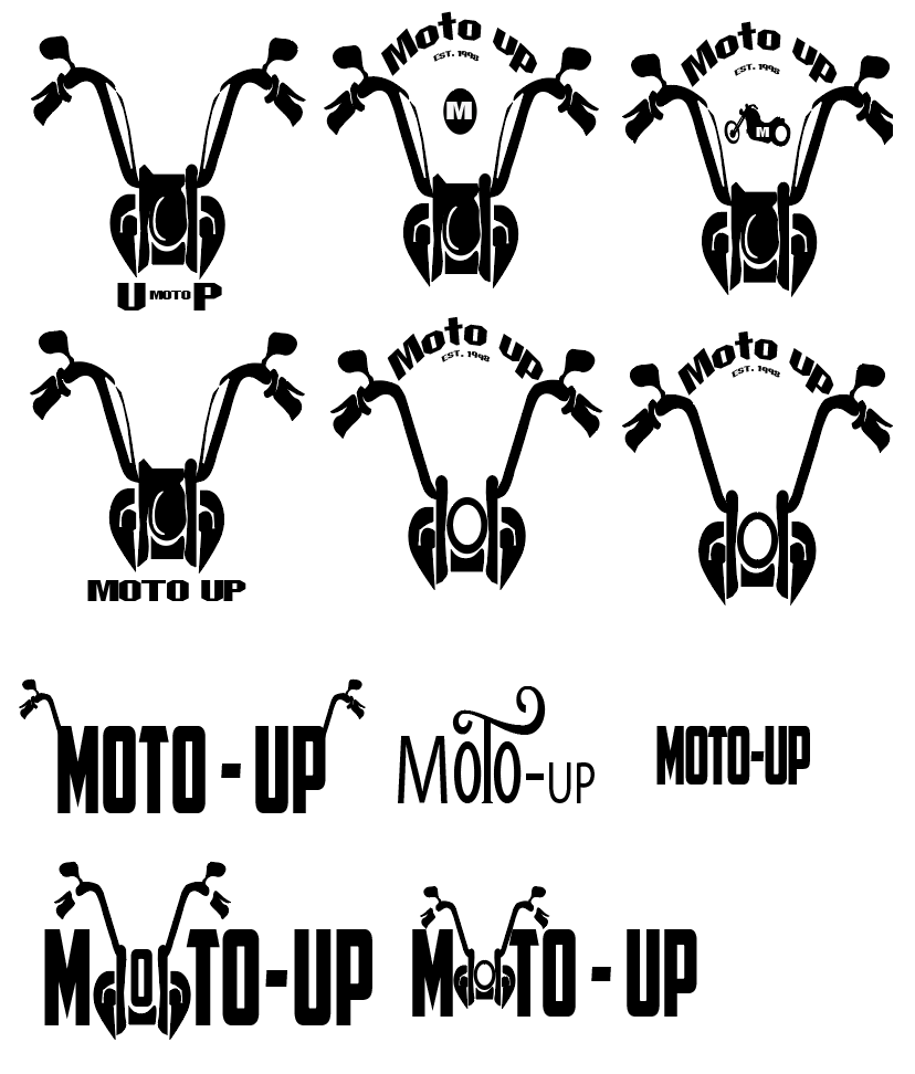
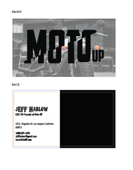
When thinking upon ideas for something that could be sleek and sexy to the viewer but for a motorcycle, my idea was to mainly use the front of a bike specifically a Harley bike in showcasing the beautiful structure and give it a geometric shape. Using an all black and white logo made the bike stand out better and when using it upon the actual package, I flipped the colors to invert the design. The font used was a heavy, hard motorcycle font which I felt matched the geometric shape of the bike best.
Making a convinent APP that was also in use with Google and Uber made it possible to combine and shape the overall look and feel to what I wanted SnakeSnack to be. I wanted to create an overall idea of Ubering rats to your home while away or even while laying in bed sick with ease. The APP was to be used in creating an account or signing in, locating a rat, choosing whether to drive or deliver, payment and then deciding on your personal Uber. The goal was to make a sleek, all black look that differed from your average Petco in bright color. The product line was to feel safe, feel fancy, and give the user more of a reson to use the APP and products.

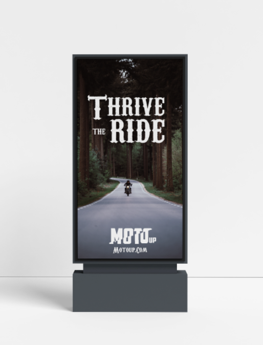
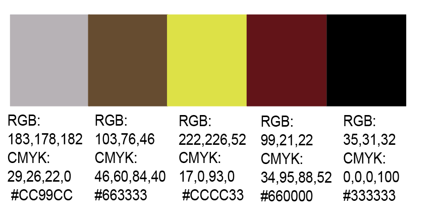
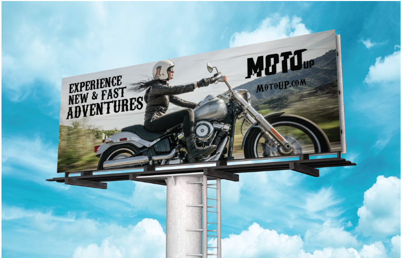
Everyone drives on the highway at every second to every hour of the day. What better way to capture the attention of thousands in traffic with a relaxing billboard that say’s “let’s take a ride the Moto-UP way. I wanted to keep the image sleek and inspirational to both parties and allow the viewer to soak in all the beautiful aspects. The mission was to keep the grey, black and white theme with hints of color but not too must to blast in the viewers face or catch them off guard. Most people want to get away and go on vacation and that was the message I wanted to take away.
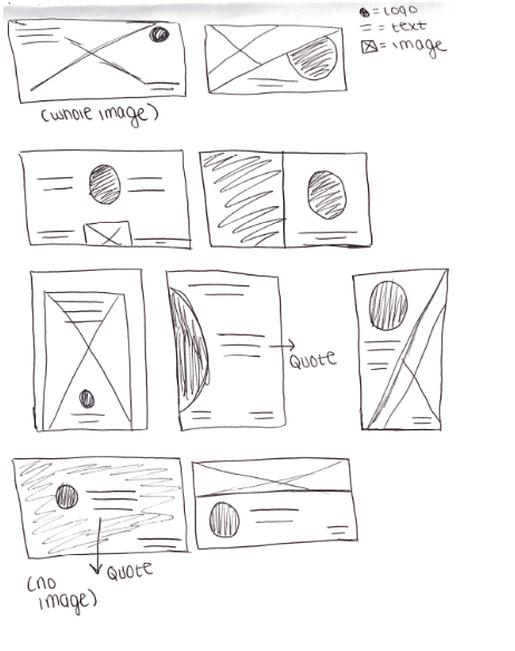


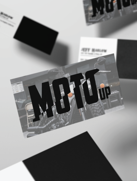
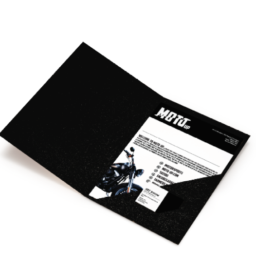
When building items that buyers and consumers could remember the company by, I wanted to make sure to keep it simplistic, classy and sleak in design to match the logo branding. The idea was to keep the jet black look with hints of gray and motorcycle features. The enjoyment was to make the items appeal to both women and men.
