

QUIPIC is a specially designed app for users to navigate through in experiancing beautiful, and clear photography without using an expensive cannon camera. The idea and concept was to simply re-design an app function similar to snapchat with new, inviting & exciting improvements. QUIPIC allows the user to really have full control in what they want and need done.

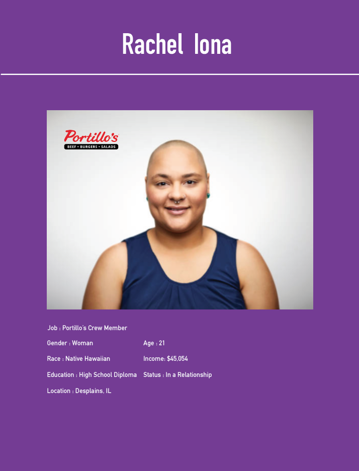
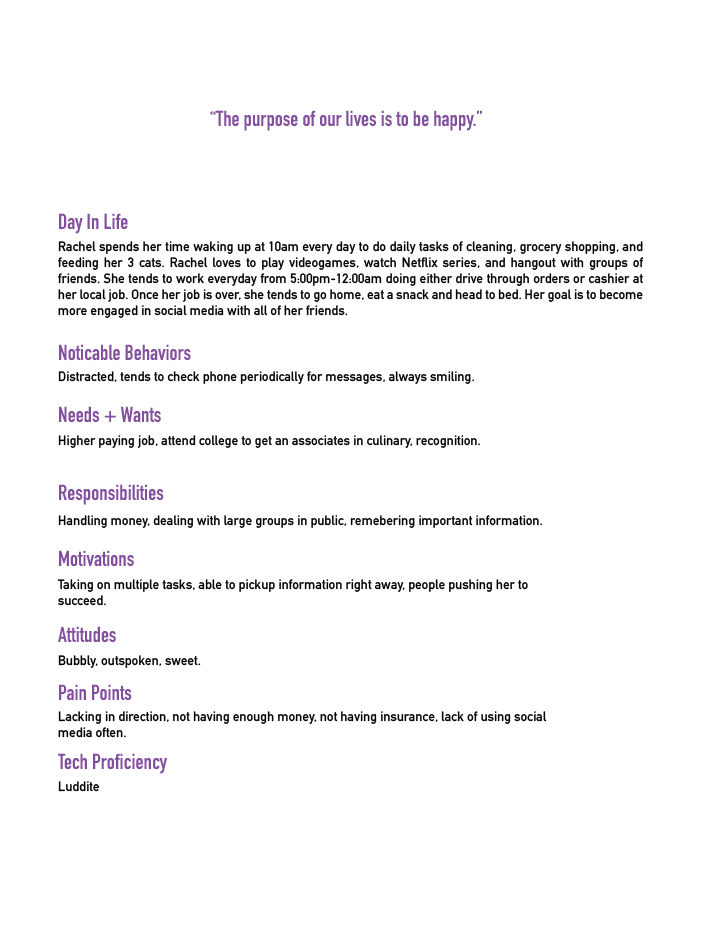
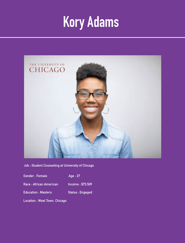
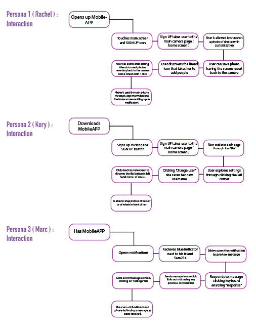
For each person, I wanted to have a variety of different ethnicities and genders to constitute for this application. The persona’s showcased different jobs, atmospheres and lifestyles that were all unique and different. For most, the majority were not school related but real life examples giving comfort to the viewer reading how they could fit in along with the application. The variety helped build the app for the better adjusting the needs and wants for all; better design outcome.
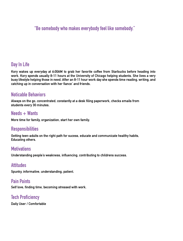
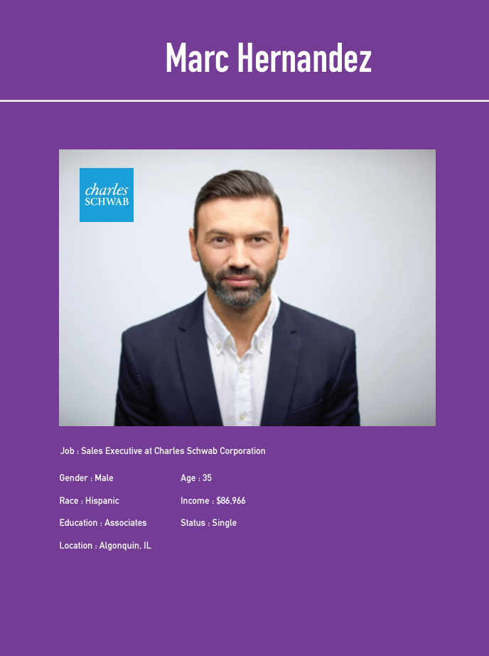
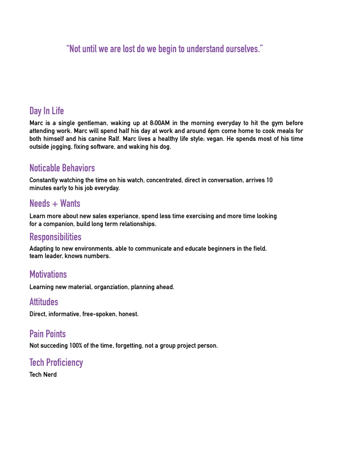
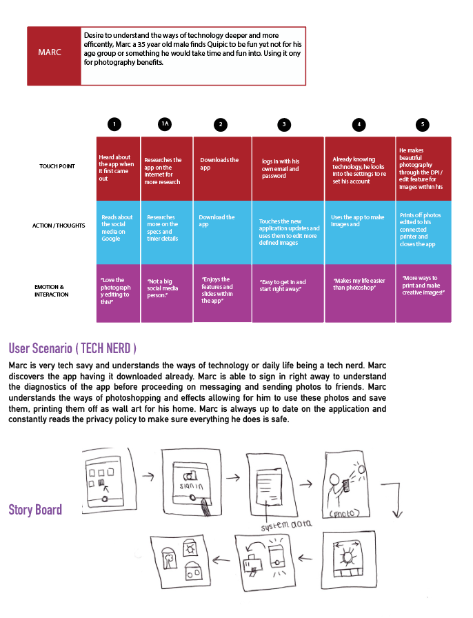
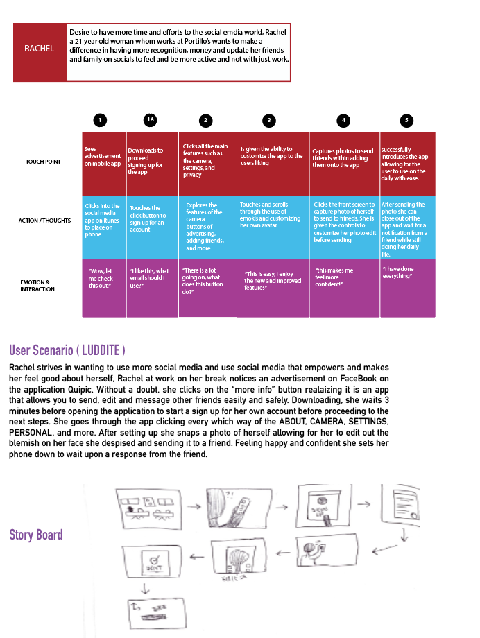
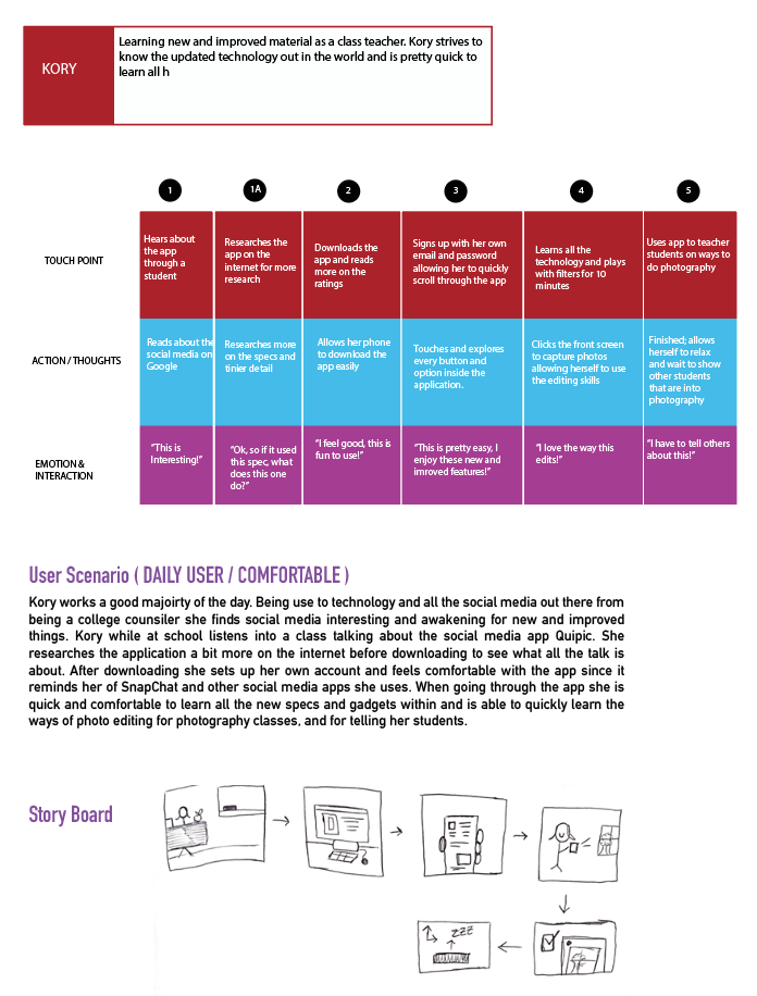
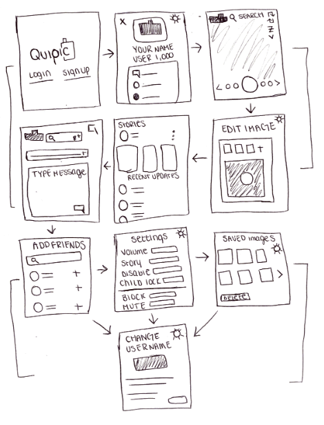
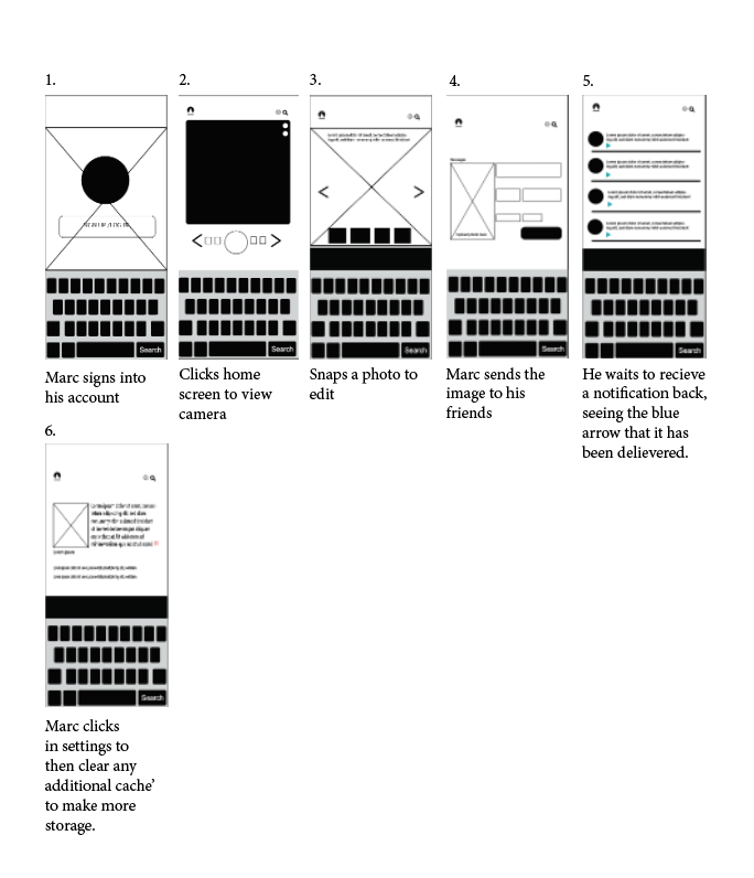
The users for the diagrams were made to be universal and showcased different attitudes or emotions when engaging with QUIPIC. The maps were editied to make sure the flow made sense to the user and how the user may touch different icons or pages within. The map with Marc showed how someone whom is familiar with the application might differ from someone whom does not. To Marc’s benefit he has easy access to messaging his friends and sending imagery of photography he has taken.

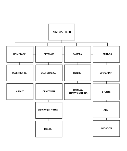
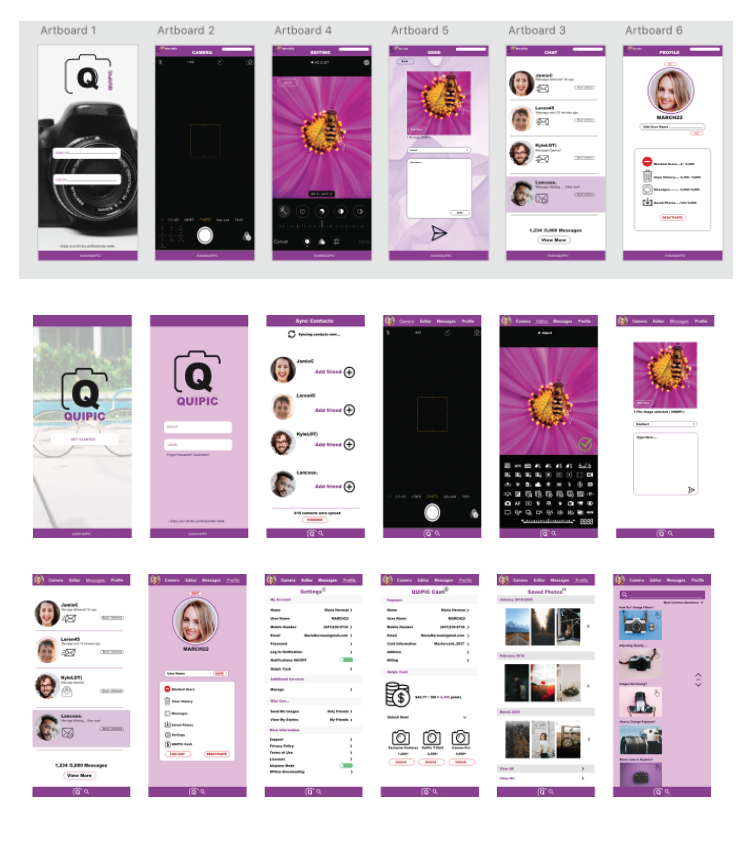
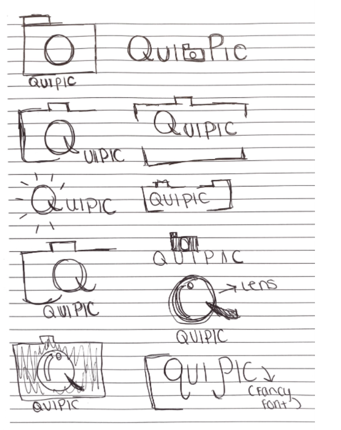
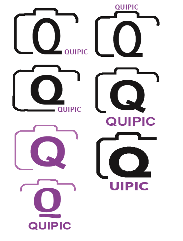
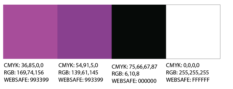
For each design as it progressed i constantly wanted to make sure I was hitting the goal of what Quipic was for myself and to the audience. The APP went through many changes of changing out design of imagery and including more and more pages to evolve on what the user could clikc and benefit from unlike other camera apps out there. I made sure to consistenty stick to a nice purple scheme and show different iterations of the logo when deciding what fit better. The end result ended up working better in design and made much more sense to the QUIPIC world.

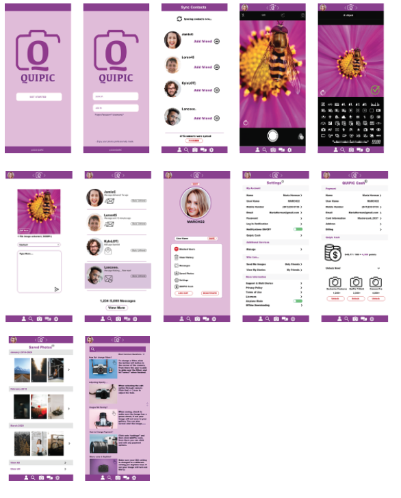
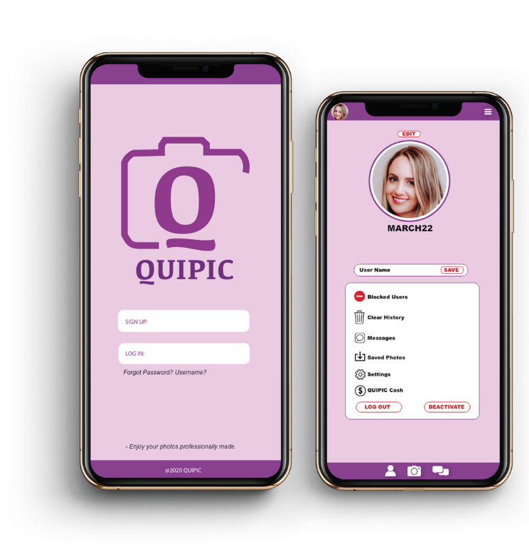
For each design as it progressed, I constantly wanted to make sure I was hitting the goal of what Quipic was for myself and to the audience. The APP went through many changes of changing out design of imagery and including more and more pages to evolve on what the user could clikc and benefit from unlike other camera apps out there. I made sure to consistenty stick to a nice purple scheme and show different iterations of the logo when deciding what fit better. The end result ended up working better in design and made much more sense to the QUIPIC world.